A few days ago I was looking at photos of some early projects and I was struck by the differences when I compared them to our recent and current projects. Fifteen years ago the majority of the internal walls in the standard chalet were wooden clad – usually a golden or an orange pine – and the painted walls were in an off or a crisp white. Even back then we had evolved our chalets a little above the norm – most “painted” internal walls were actually an abrasive sprayed textured finish which could remove the skin from your arm if you brushed up against it. We steered clients away from this perilous product and specified smooth white painted walls.
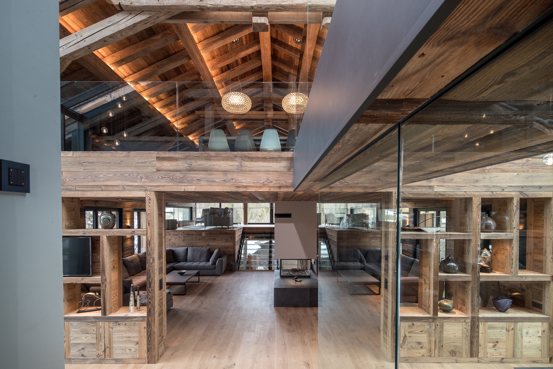
Nowadays, things are very different for several reasons. Firstly we have reduced the proportion of wood to painted walls in our projects – typically a maximum of two wooden walls in a room as opposed to previously having just an occasional painted wall. However, the main change is in the choice of wood and therefore of paint colour. In recent years we have moved to frequently specifying vieux bois (old wood). This is a higher-end product with tonal and textural variations that give a beautiful alpine feel, meaning that we can be more innovative and contemporary in our design as the vieux bois creates a strong chalet-style base to the design. Given the varying hues in old wood, a grey colour palette is much more complementary to an interiors scheme than a stark white. The colour tones in vieux bois change according to the batch – it is not a homogenous product – but there are naturally greys in the wood which plays well into a grey paint palette, whilst the grey paint also dampens down the red end of the old wood colour spectrum.
Of course, there are many grey paints available; we do not specify 50 shades of them! We have 4 or 5 specific paint colours in our arsenal, and usually suggest 2 or 3 of them on a project ranging from pale to dark, depending on the chalet design. Here is a look at several of our recent projects and the grey’s we have used:
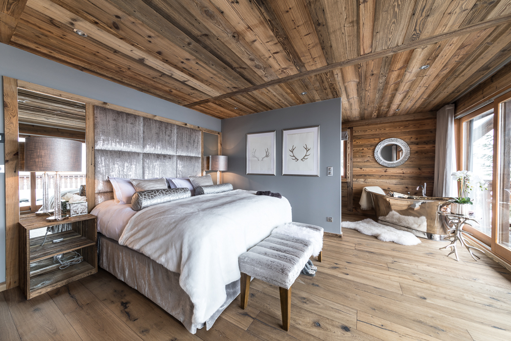
The first chalet is owned by the fabulous Natasha Kaplinsky and her lovely husband Justin. For this renovation project we wanted a grey colour palette to act as a sumptuous backdrop for not only the rich old wood cladding we specified, but also for the opulent and sparkly interiors scheme.
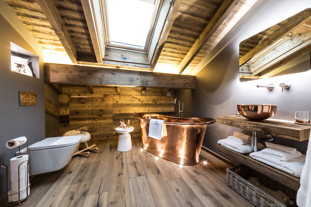
For this bathroom in the eaves of the chalet we did not want “heavy” tiles on the walls. Instead, the grey painted colour palette creates a softer look, whilst beautifully complementing the copper bain de bateau tub.
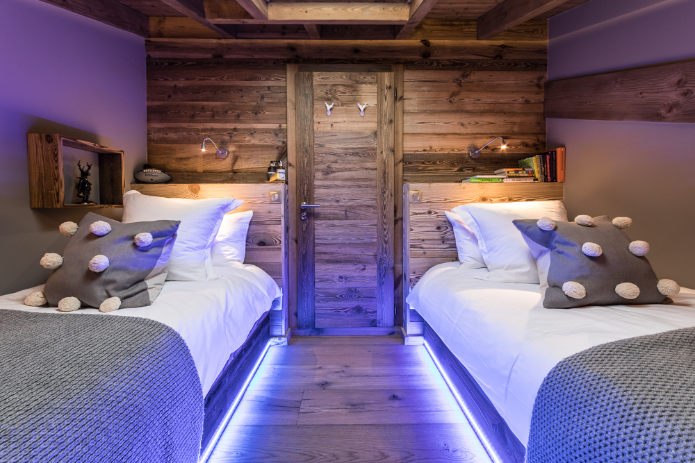
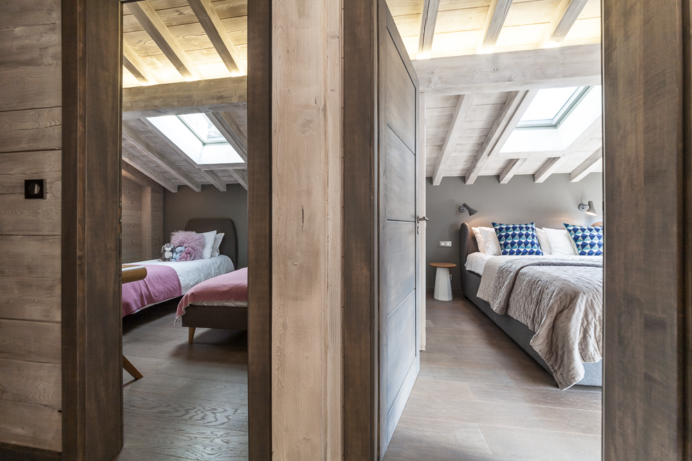
Also in the eaves there is a children’s bedroom. The smart vieux bois and grey interior is given a fun twist with the colour changing LED lighting along the base of the custom designed old wood beds.
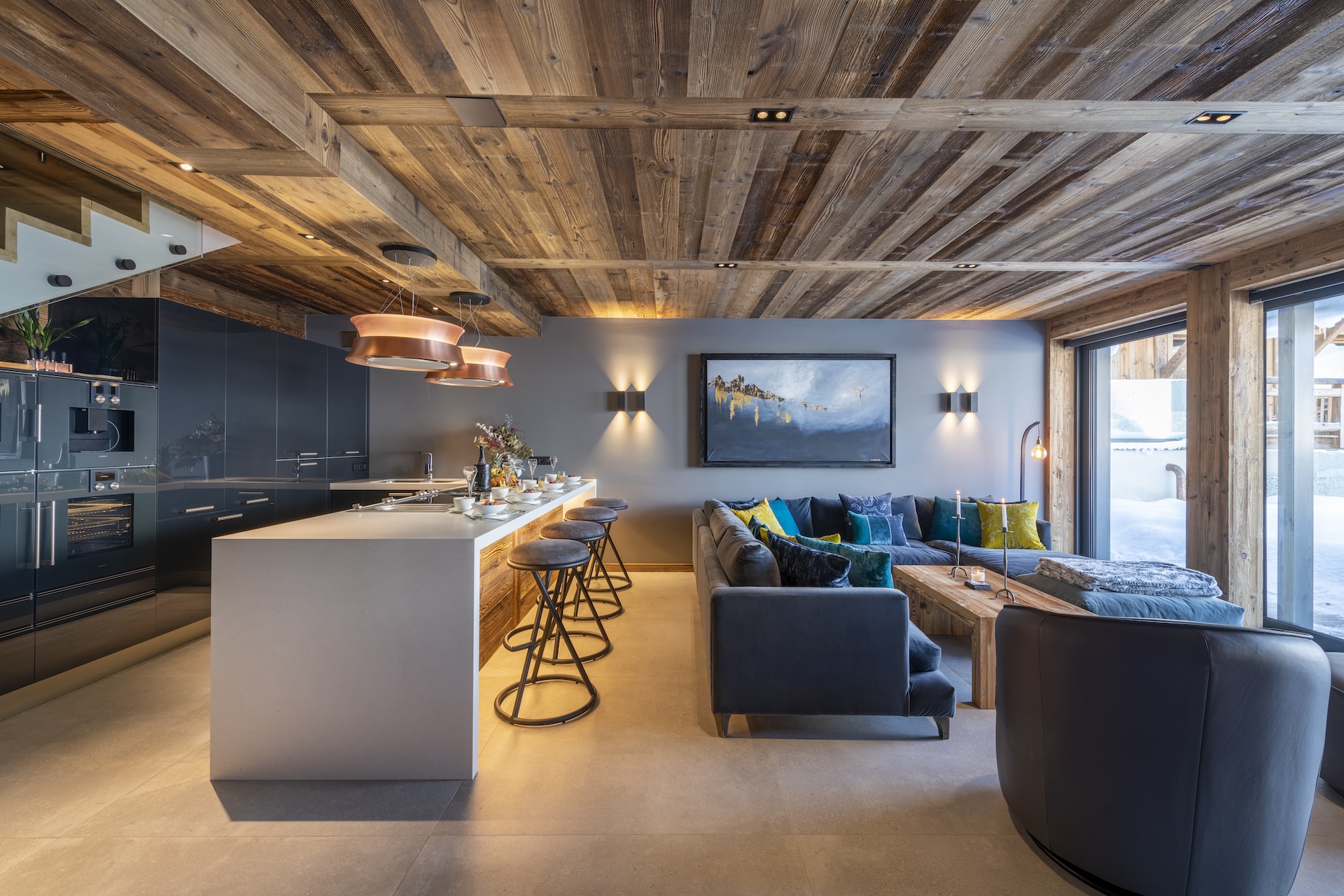
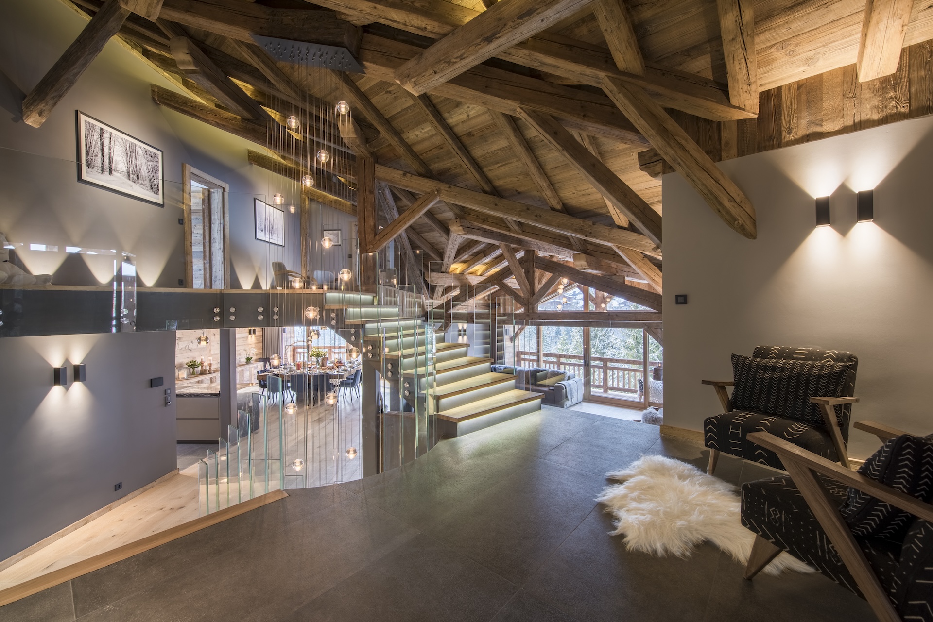
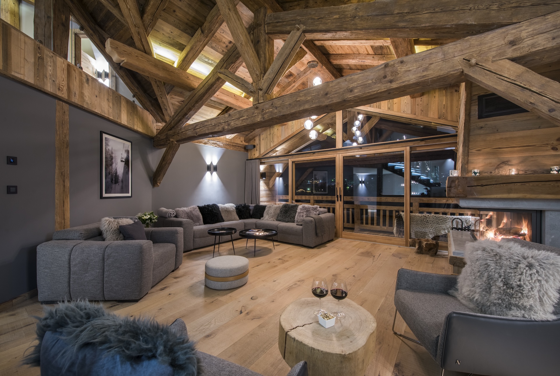
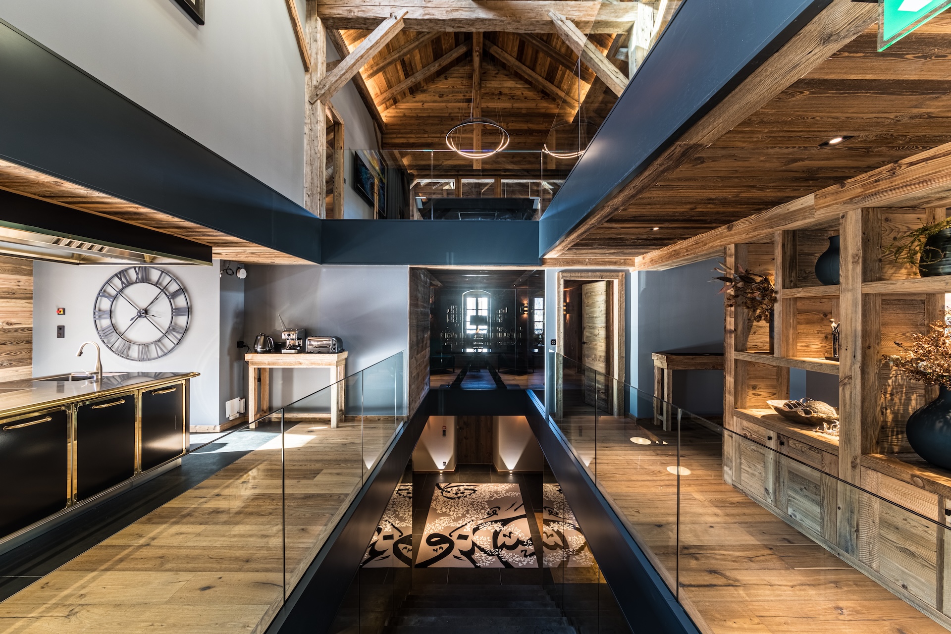
Chalet Joux Plane is one of our more contemporary projects. A new-build property locally nicknamed the “James Bond chalet”, we teamed old wood and vast expanses of glass (including a glass staircase!) with a contemporary grey colour palette.
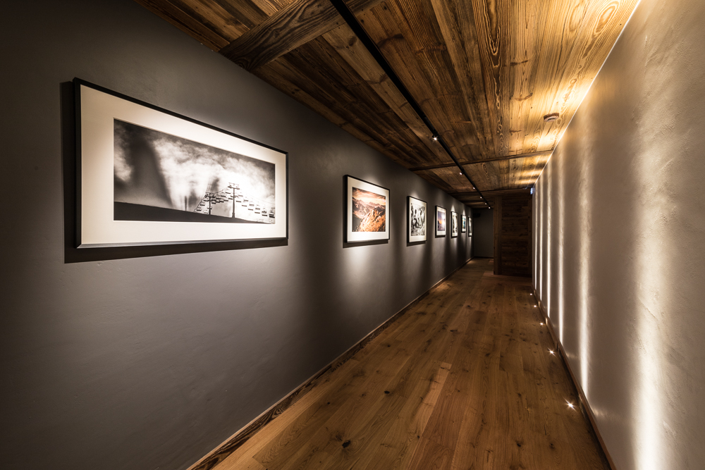
Our darkest grey was used in the art gallery. This is an underground passageway between the bootroom below the garage block and the main chalet. Instead of painting this a bright white, we embraced its location and painted one wall a pale grey with a series of recessed uplights for sculptural illumination. The other wall – all 20 metres of it – was painted a dark grey and hung with art from local photographers. Teamed with an old-wood ceiling and oak floor this is a luxury, contemporary twist on an utilitarian corridor.
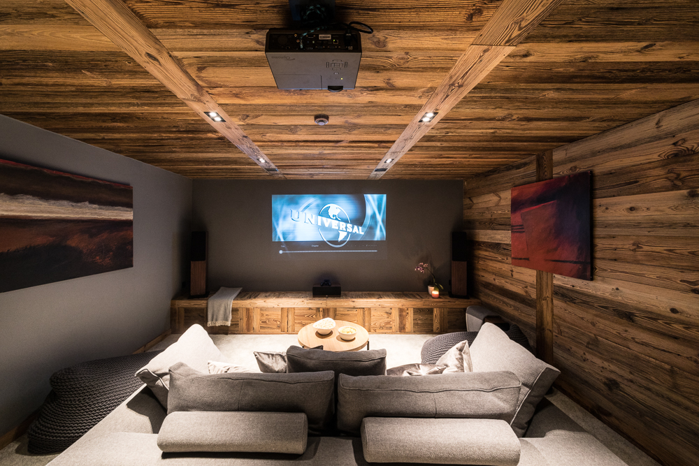
In the cinema room we used the same dark paint colour in collaboration with the audio-visual designer, as we wanted a paint colour that would obviate the need for a projector screen – the image is projected directly onto the wall!
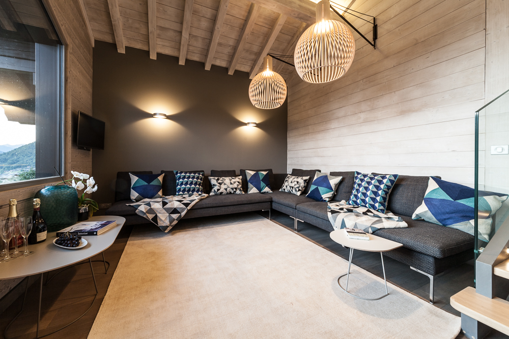
Chalet Hibou Blanc is very different. For this renovation we designed a grey and white Scandinavian influenced chalet. Here the grey was not used to soften the wood, but rather as a strong colour block contrasting against the white stained wooden walls and ceilings.
In the salon area we used a dark grey as a feature wall with architectural up/down wall lighting. The dark sofa and pale rug continue the colour palette of the walls, ensuring that the Scandi geometric cushions pop in contrast.
In the master bedroom we used two shades of grey – a pale hue on the demi-wall that divides the bedroom area from the freestanding bath and basins, and a darker grey on the wall at the head of the bed. The furnishings are in shades of grey and white – again with geometric cushions as a decorative feature.
Chalet Sapphire is a luxury ski lodge operated by The Boutique Chalet Company. In this project we used four different shades of grey paint across the property to complement the vieux bois structure and walls.
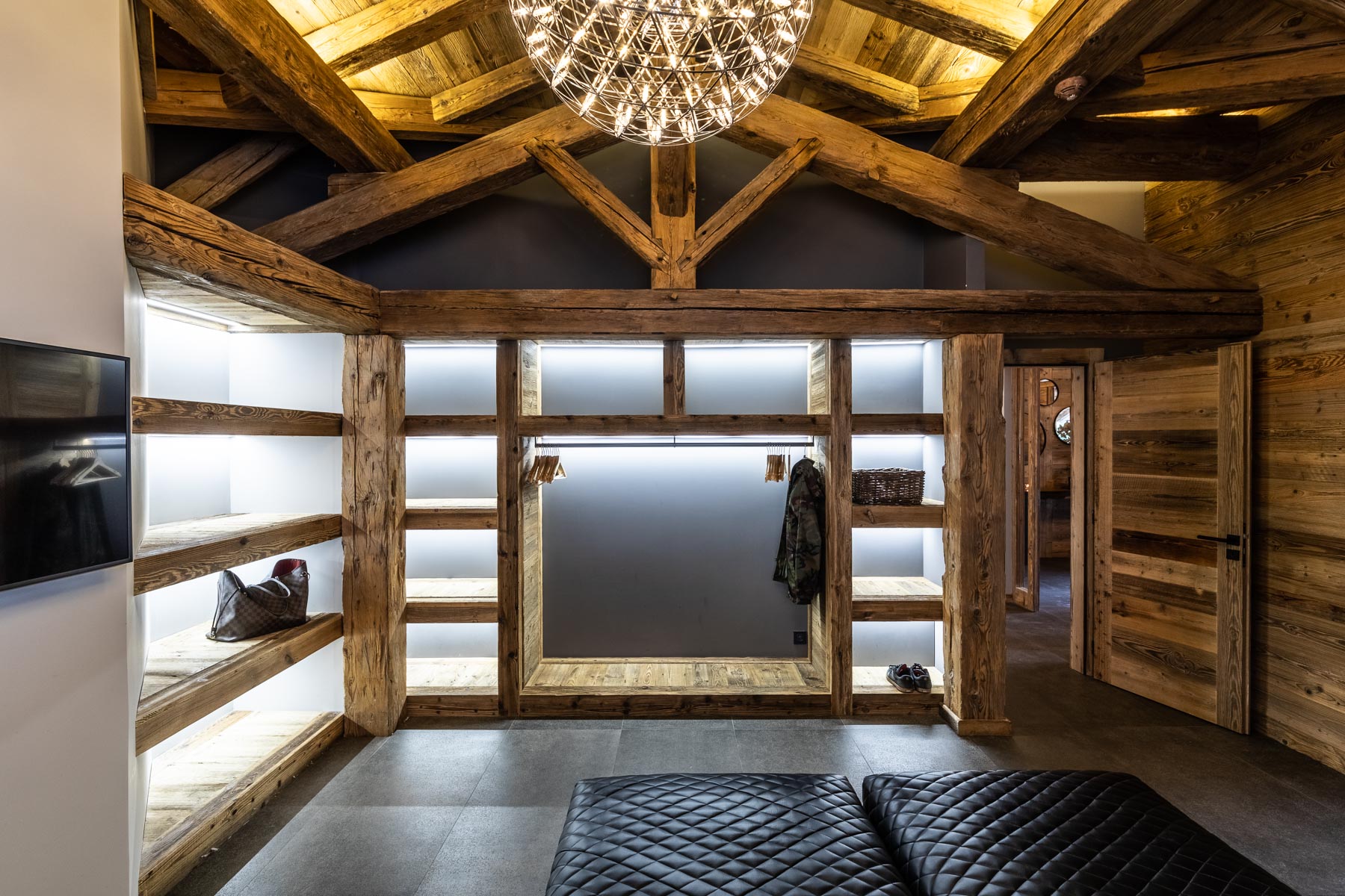
In the bootroom the wooden chalet structure and painted walls are adjacent. The anthracite grey contrasts beautifully with the timber-frame and the bespoke vieux bois storage unit. The tiled floor was chosen as a match to the dark grey paint. The wall to the left in the photo is in the palest grey hue so that the room is not too heavy, and to draw the eye towards the dark feature wall.
In the salon area the mid-grey paint is used to break up the wooden floor, walls and exposed timber-frame. Again we used a pair of architectural up/down wall lights to add interest. This is accentuated by the black and white artwork. The soft furnishings continue this colour palette, teamed with faux-fur cushions.
Our final study is La Maison. We featured this property in a previous blog, explaining a little about the history, renovation process and design direction for this gorgeous home. The colour palette is old wood (particularly the timber frame on the upper floor), glass and grey. We used a combination of pale and mid grey paint, dark grey sandstone on the main stairwell and the lower level of the property, and anthracite grey metalwork cladding the tremie in the stairwells.
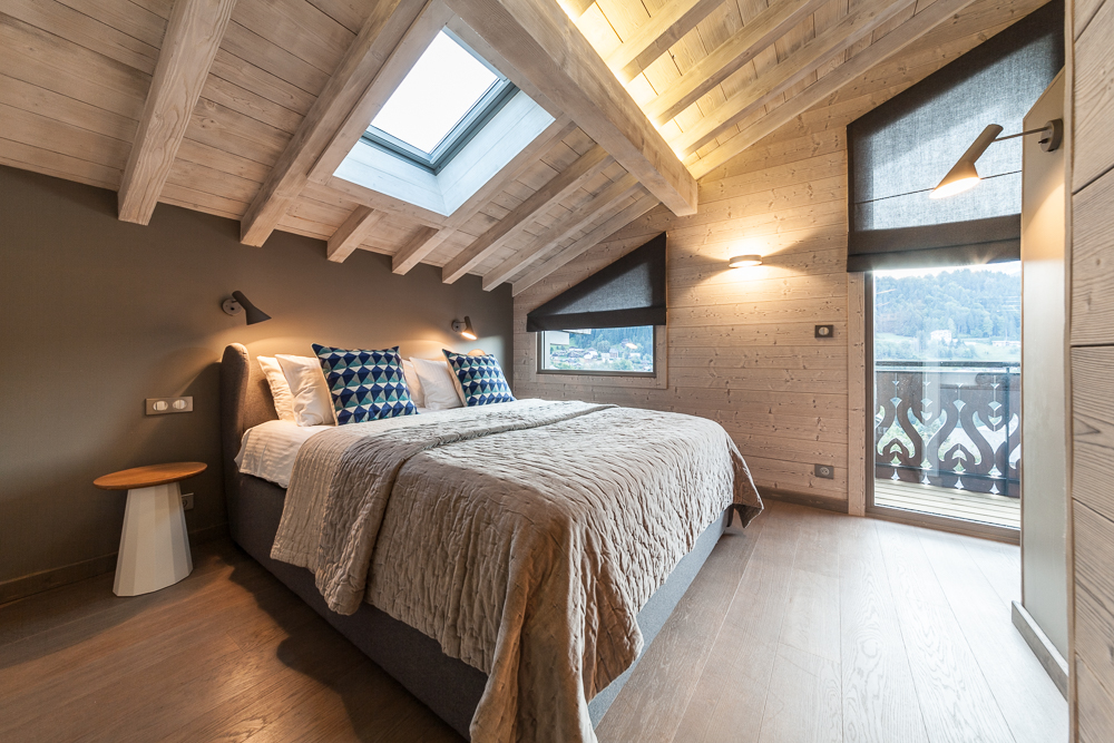
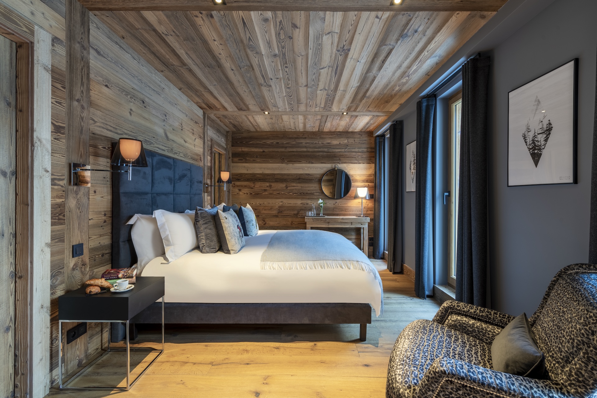
In this bedroom we used mid grey paint to complement the vieux bois walls and ceiling. The dark grey curtains frame the windows and are the same shade as the headboard and upholstered bed base. The coloured birds on the Timorous Beasties cushions provide a subtle pop of colour in this elegant, sophisticated bedroom.
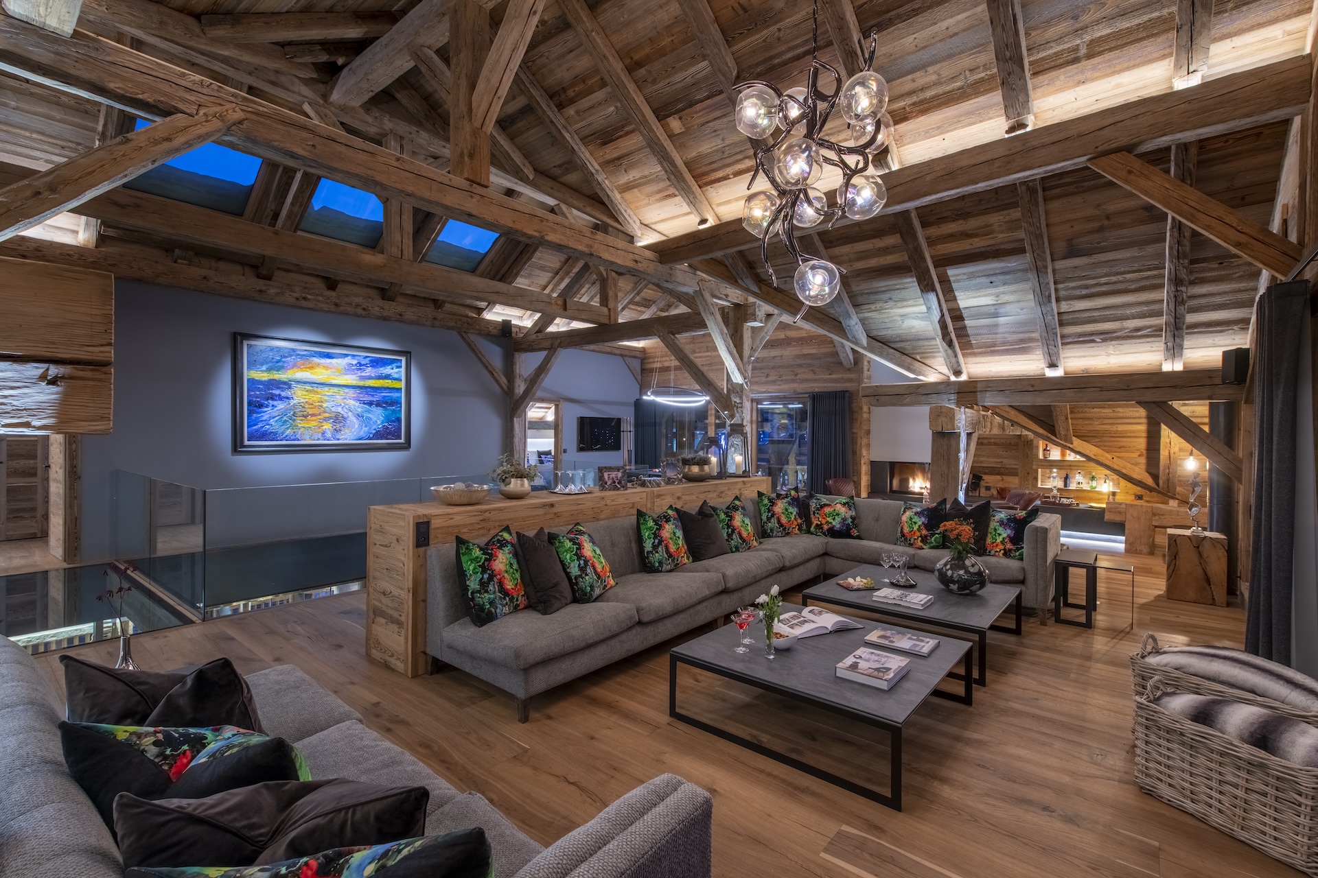
On the top floor of the property old-wood dominates. The mid grey spine wall is therefore a bold feature, also acting as a backdrop to the large Jomolo painting. The soft furnishings are grey, with the bright Timorous Beasties cushions adding a vibrant punch of colour.
Photography: Neil Sharp, and with kind permission of The Boutique Chalet Company